Store Layouts for Digital Goods: Product Grid or Price List?
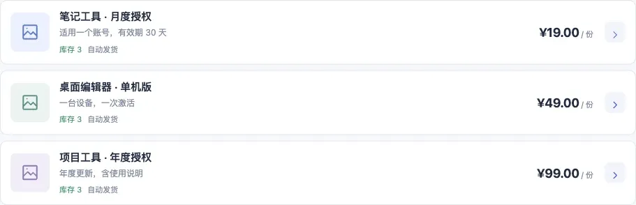
Compare the same three software licenses in both layouts. Choose a grid for visual discovery or a list for comparing terms and prices.

The same products can be displayed in two ways. Which one fits depends on what you sell, how much of it, and how your buyers make decisions. This post helps you choose in five minutes.

Product cards: let the images speak
The product-card layout uses square cover images in a multi-column grid. Buyers can tell items apart at a glance.
It suits products that need to be seen, such as design assets, e-books and course redeem codes. Much of their value is visual: a good cover persuades a buyer to click more effectively than a paragraph of text.
Best when:
- you have a small catalog and each item deserves its own spotlight;
- you have clear, attractive product images;
- buyers decide mostly by what they see and tend to browse.
With this layout, image quality defines how your store looks. Use square covers with a consistent style and proportions, the subject centered and minimal text. If you sell redeem codes for assets or e-books, sell redeem codes has more setup tips.
Compact list: keep information tidy
The compact-list layout puts categories in a sidebar and lists products in rows, with price and stock visible at once. With a larger catalog, buyers can jump straight to a category.
It suits buyers with a clear goal: they know what they want before they arrive and care about whether it is in stock and how much it costs, not what it looks like. Software license keys are the textbook example.
Best when:
- you sell many products in clear categories;
- buyers already know what they want;
- price and stock matter more than visuals.
With this layout, the product title is the most important piece of information. Put the edition, term or denomination in the title — for example “Pro edition · 1-year license” — so buyers can decide without opening the details. See sell software license keys online.
A table to help you choose
| Your situation | Recommended layout |
|---|---|
| Fewer than a dozen or so products, each with a good cover | Product cards |
| Many products in clear categories | Compact list |
| Selling assets, e-books or courses | Product cards |
| Selling license keys or multi-denomination codes | Compact list |
| Mostly returning buyers who know what they want | Compact list |
| Mostly new visitors who need to be drawn in | Product cards |
Light and dark
Both layouts support light and dark themes. Light is the safe default for most products; dark adds atmosphere for colorful assets or audiences such as developers and gamers. Buyers can also switch themes themselves in the store.
Writing your store announcement and support contact
The layout is your store’s skeleton; the announcement and support contact shape buyers’ first impression and trust.
The store announcement appears on your store page. It is a good place for:
- what you sell and who it is for, in one sentence;
- how delivery works: automatic after payment, with codes shown on the delivery page;
- how after-sales works: file a complaint with the order number;
- important notices, such as new arrivals or a product being paused.
Keep it short — three to five lines is plenty. Detailed instructions belong in each product’s description, not the announcement.
The support contact is how buyers reach you outside of complaints. Use a channel you actually check, and mention a typical response time in the announcement, such as “replies within 24 hours on weekdays”. Buyers who know when to expect an answer are less anxious, and you will receive fewer complaints.
Four common mistakes
Mistake 1: a big catalog always means a list. If your many products all have great covers and buyers like to browse, product cards may still convert better. Look at how buyers shop before counting products.
Mistake 2: the layout is permanent. You can switch layouts at any time without affecting products or inventory. If you are unsure, start with the defaults and adjust based on buyer feedback.
Mistake 3: layout matters more than content. No layout can rescue vague titles and missing instructions. Clear titles, prices and redemption steps matter more than which layout you pick. For writing instructions, see the fourth habit in four habits for keeping your code inventory in shape.
Mistake 4: choosing by personal taste. Your store is for your buyers. Rather than going by feel, watch how they behave: if people often ask “do you have version X?”, they are looking for specific items and compact-list categories will help; if they say “just browsing”, product cards will spark more interest. Asking a few regular customers is often the most accurate guide of all.
Next step
Once you have chosen a layout, share your store link and start selling — delivery is handled automatically around the clock. For the full picture, start with meet Kamai.
Frequently asked questions
Does the layout change the stock?
Both layouts display the same products and inventory.